 Add Element
  Add Row
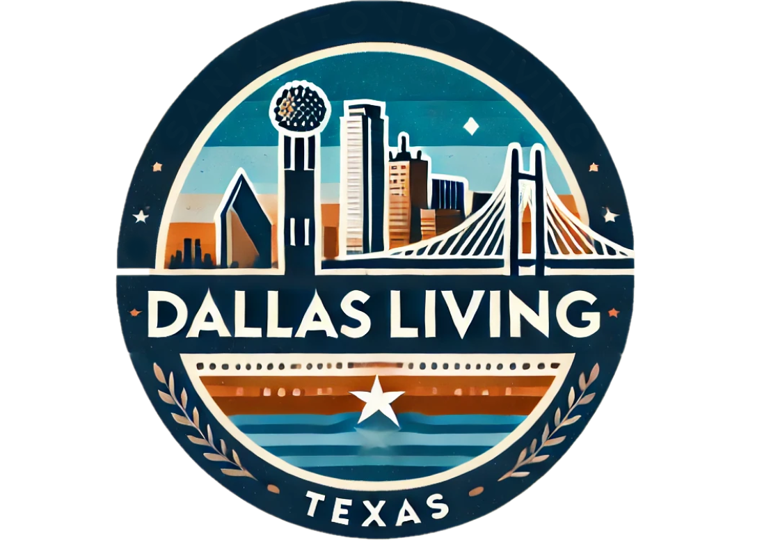


Austin’s Logo Under Fire: A Design Dispute
Austin’s new city logo has sparked a wave of online criticism, with many social media users and local officials drawing direct comparisons to the well-established logo of Dallas. This visual backlash not only challenges the creative integrity of the new design but also ignites a broader conversation about city branding in the age of rapid digital communication and aesthetic homogenization.
The Online Reaction to Austin’s New Logo
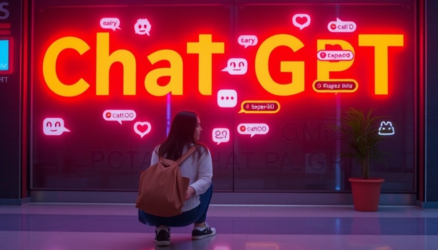
The internet’s swift critique of the Austin logo has been nothing short of fierce. Comments such as “All the consultants did was Chat GPT the Dallas logo” highlight a shared sentiment that the new logo lacks originality and feels reminiscent of existing designs. A particularly biting comment described it as looking like "a local credit union" or even “a homeless tent.” For a city celebrated for its eclectic spirit and quirkiness, the reception of a seemingly sterile and generic logo has left many bewildered.
Official Perspectives: City Leaders Weigh In
Dallas City Councilwoman Cara Mendelsohn publicly acknowledged the resemblance, stating, “It’s undeniable that they look alike.” Mendelsohn, emphasizing the strength of the Dallas logo, further remarked, “The Dallas city logo is actually one of the best city logos in America.” This praise for Dallas’s branding contrasts sharply with the scrutiny faced by Austin’s design, raising questions about how cities express their identities visually.
Color Palettes and Visual Similarities
While both logos utilize shades of green and blue, the specific color codes differ. However, when in use, they create a visually similar impression. The fonts and overall earthy vibe of each logo contribute to the uncanny resemblance, prompting discussions about the aesthetics of city branding and how they communicate a city’s identity. The Austin brand identity firm, Pentagram, has defended the design by stating it reflects the unique spirit and diverse perspectives of Austin.
Role of Leadership in Branding Decisions
Interestingly, the announcement of Austin’s new logo came from T.C. Broadnax, who previously served as Dallas City Manager. This connection has only intensified the speculation regarding the logo’s similarity. It raises essential questions about the influence of leadership on city branding projects and whether familiar faces bring biases in creative directions for city identity.
The Bigger Picture: Importance of City Branding
The visual representation of a city can significantly impact its public perception. A city’s logo is often a first impression, encapsulating its values, cultural essence, and aspirations. As people engage more with urban areas, especially through digital platforms, the need for a distinctive, relatable brand becomes critical. As such, Austin's branding choices speak volumes about its desired image amid growing population and visitors attracted to its unique culture.
Future Trends in City Logos and Branding
Given the evolving landscape of urban identity, Austinites and other cities might benefit from a renewed focus on innovative and authentic branding methods. As the backlash continues, city officials must heed community feedback while also ensuring curb appeal through distinct visuals that can set them apart. The integration of community-driven narratives in design processes could serve to enrich city branding and foster a deeper sense of belonging.
Concluding Thoughts on Austin’s Branding Challenge
The discussion surrounding Austin’s new logo is more than just about colors and shapes; it underlines the broader implications of branding within urban contexts. As cities strive for unique identities, the push and pull of public opinion will play a crucial role in shaping the future of their visual representations. Engaging the community in these conversations can yield not only more relevant designs but also foster a stronger connection between a city and its inhabitants.


Write A Comment